Kawabonga Surf — Branding Identity
Project Overview
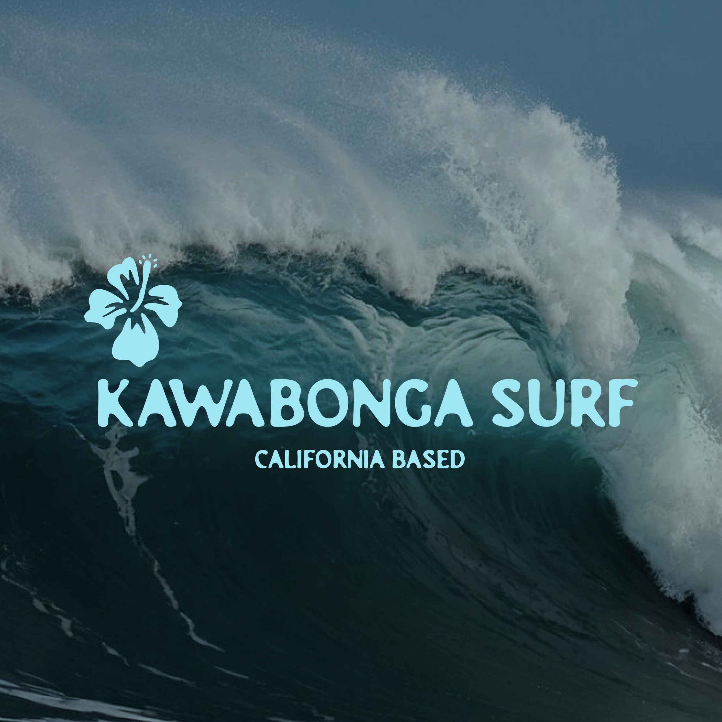
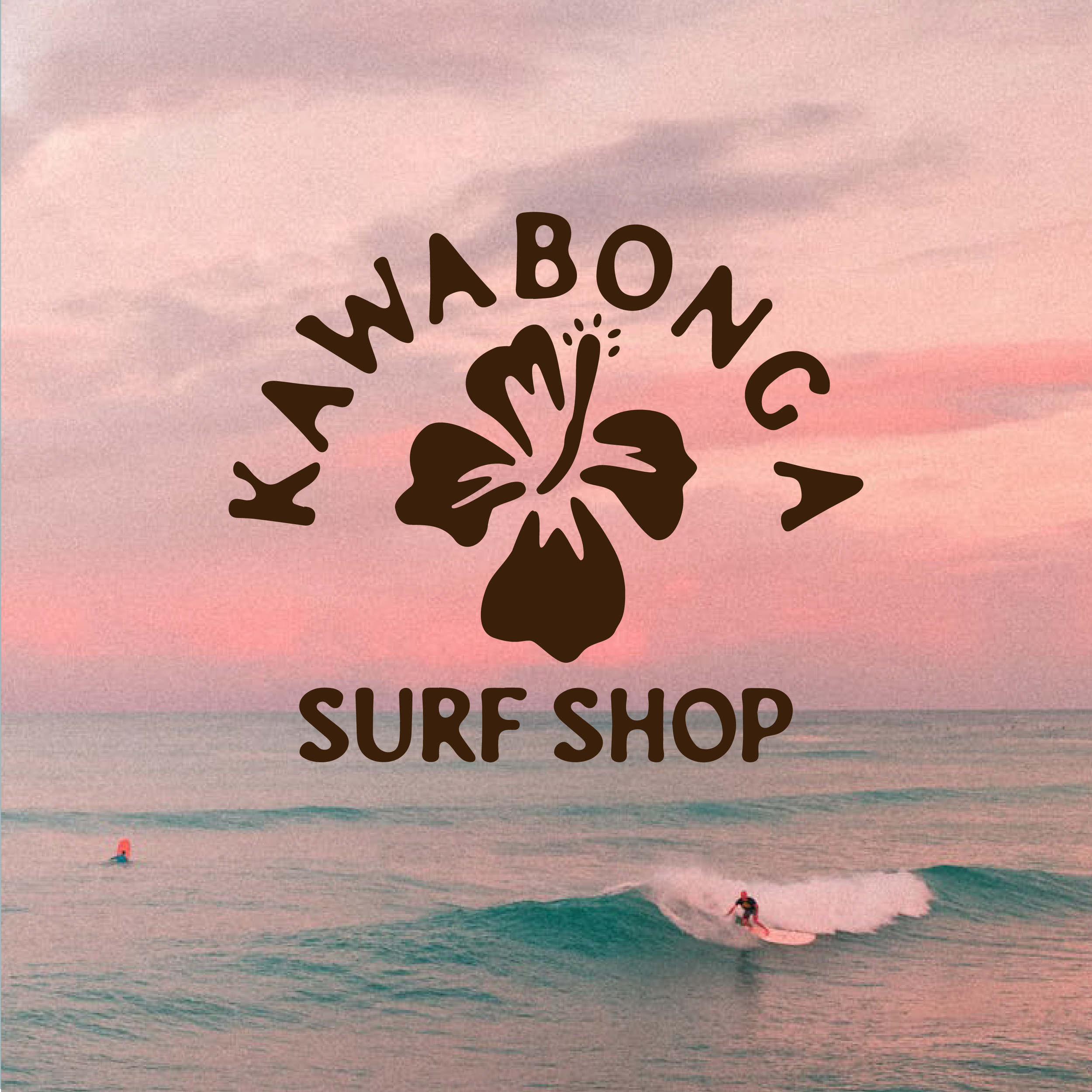
Kawabonga Surf is a California-based surf shop inspired by coastal adventure, laid-back energy, and the spirit of the sea. I developed a brand identity that blends tropical vibrance with a casual, surf-centric lifestyle — channeling the freedom and fun of wave-chasing days through bold, beachy design.
Design Elements
Logo Design:
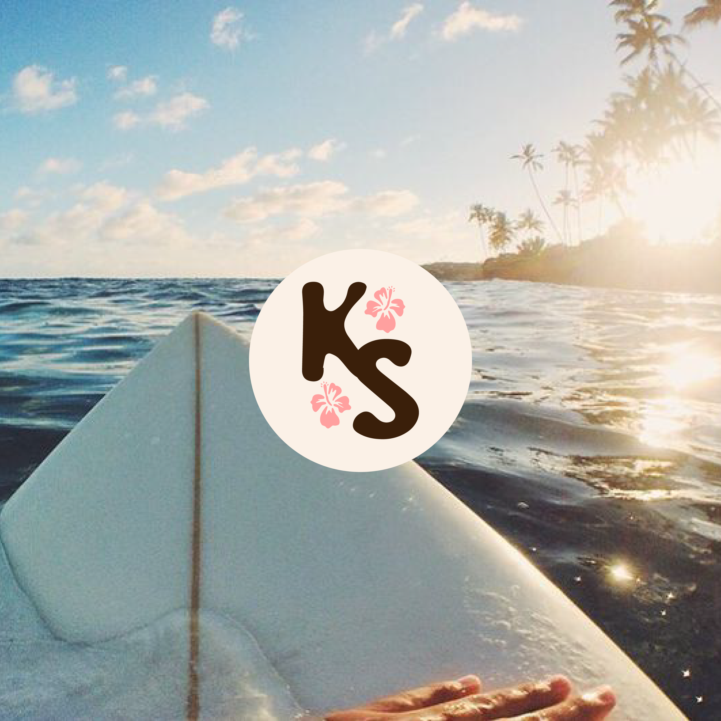
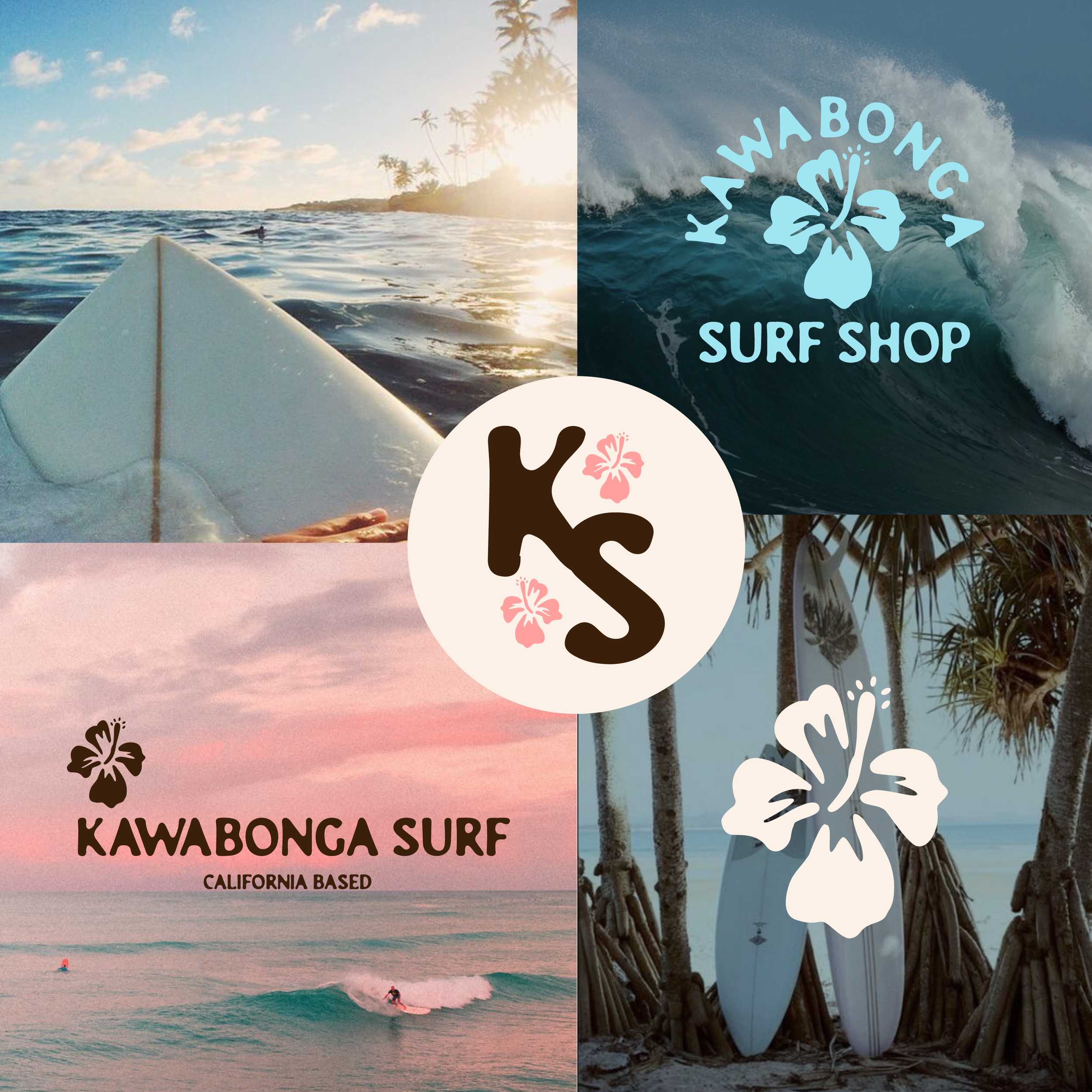
The primary logotype features a rounded, playful typeface paired with a hibiscus flower — a nod to the classic surf aesthetic. A secondary “KS” monogram was crafted with integrated floral accents for use across merchandise, signage, and social platforms.
Color Palette:
Ocean-inspired blues, soft sandy neutrals, and bright hibiscus pinks evoke sunny days, surf wax, and sea spray — creating a palette that feels both fresh and nostalgic.
Monogram & Iconography:
The “KS” monogram and standalone hibiscus icon offer flexible applications for branding moments big and small, from surfboard decals to apparel tags.
Typography:
Rounded, friendly letterforms reflect the laid-back tone of surf culture while remaining clean and distinctive for brand recognition.
Mood & Imagery:
Photography showcases real surf scenes — golden hour coastlines, board wax-ups, and tropical palms — grounding the brand in authenticity and ocean lifestyle appeal.
Tone & Concept
This identity is all about capturing the carefree essence of surf life. Every detail — from the flowing type to the sun-faded hues — was chosen to reflect a community that lives by the tides and moves with the rhythm of the waves.