Sweet Bell Handmade Ice Cream — Branding Identity
Project Overview
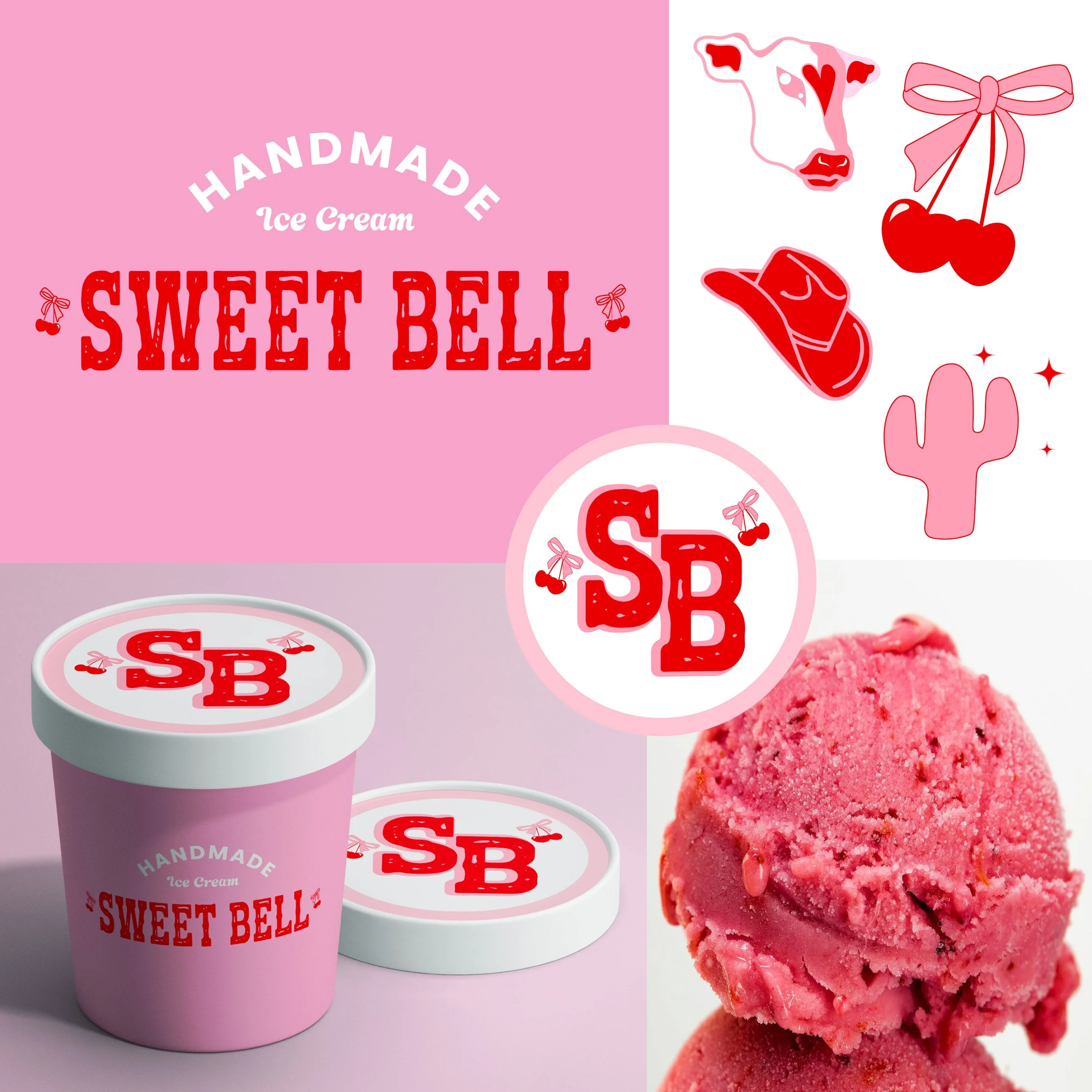
Sweet Bell is a handmade ice cream brand that blends nostalgic charm with a playful Western flair. Tasked with creating a full brand identity, I developed a visual direction that feels both handcrafted and joyfully bold, appealing to modern customers seeking artisanal quality with a fun twist.
Design Elements
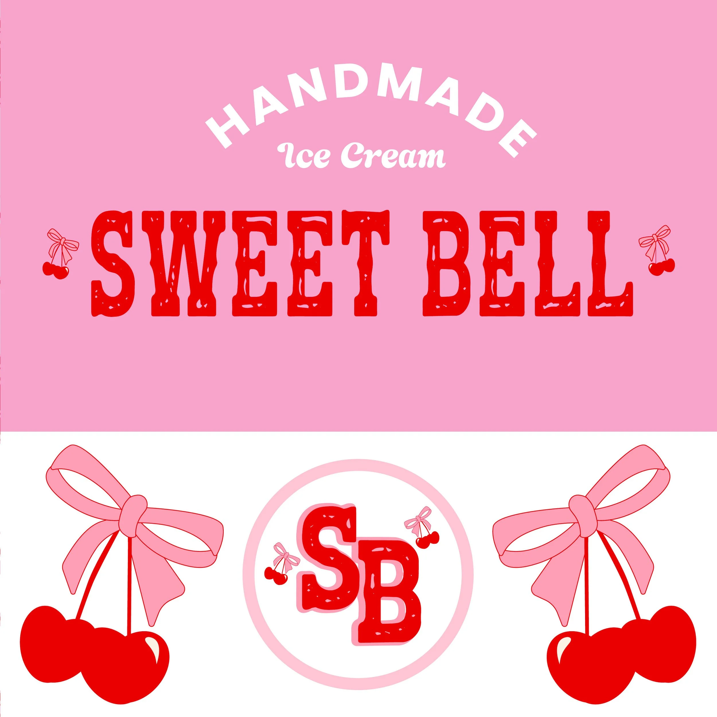
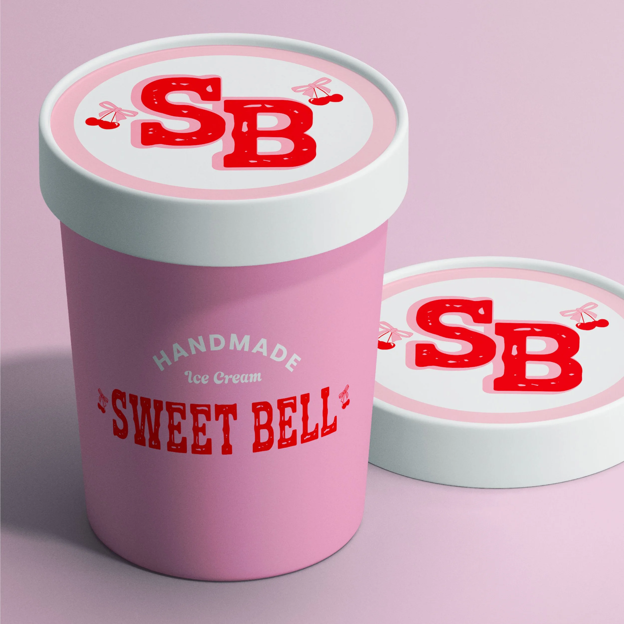
Logo Design: The logotype features a western-style slab serif font in a cherry red hue, accented with delicate bow and bell icons to emphasize the name “Sweet Bell.”
Color Palette: A vibrant mix of bubblegum pink, creamy whites, and bold reds was chosen to evoke both sweetness and a retro Americana vibe.
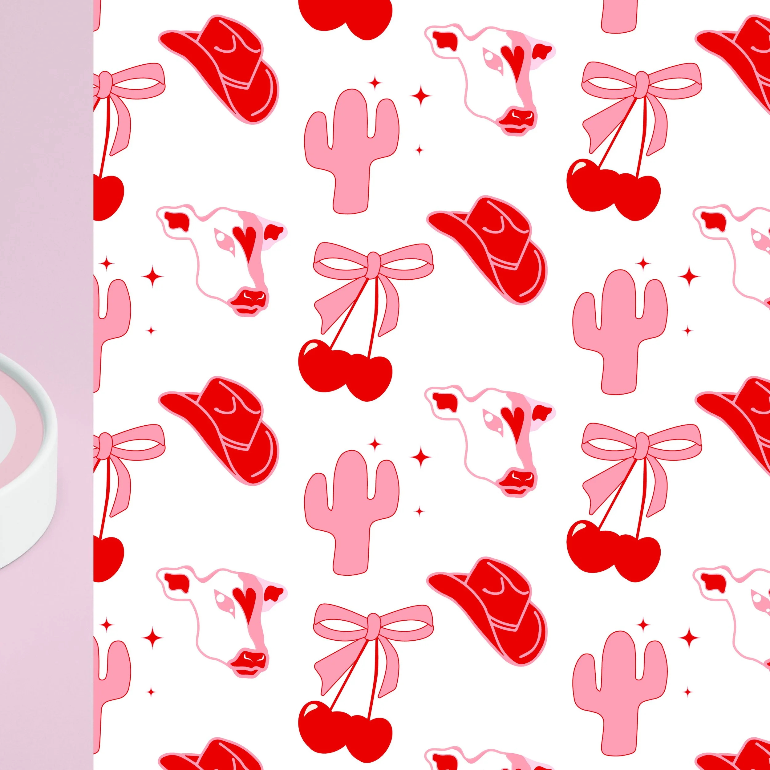
Iconography: Custom illustrations including a cow, cherries, cactus, and cowboy hat reinforce the handmade, down-to-earth feel with a touch of whimsy.
Packaging: The ice cream container design incorporates the logo prominently, using the color palette to create an eye-catching and cohesive look.
Typography: Playful yet structured fonts were selected to balance handmade charm with readability and brand consistency.
Tone & Concept
The concept behind Sweet Bell is rooted in rural nostalgia and small-batch craftsmanship. I wanted every visual element to reflect a lovingly handmade product — from the soft curves of the icons to the textured serif lettering. It’s cute, western, and full of personality.