Little Flutters Play Haven — Branding Identity
Project Overview
Little Flutters Play Haven is a joyful and imaginative space for children to explore, create, and grow through play. I designed a brand identity that celebrates childhood wonder, gentle energy, and the freedom of creative expression — captured through bright color, playful typography, and a whimsical butterfly motif.
Design Elements
Logo Design:
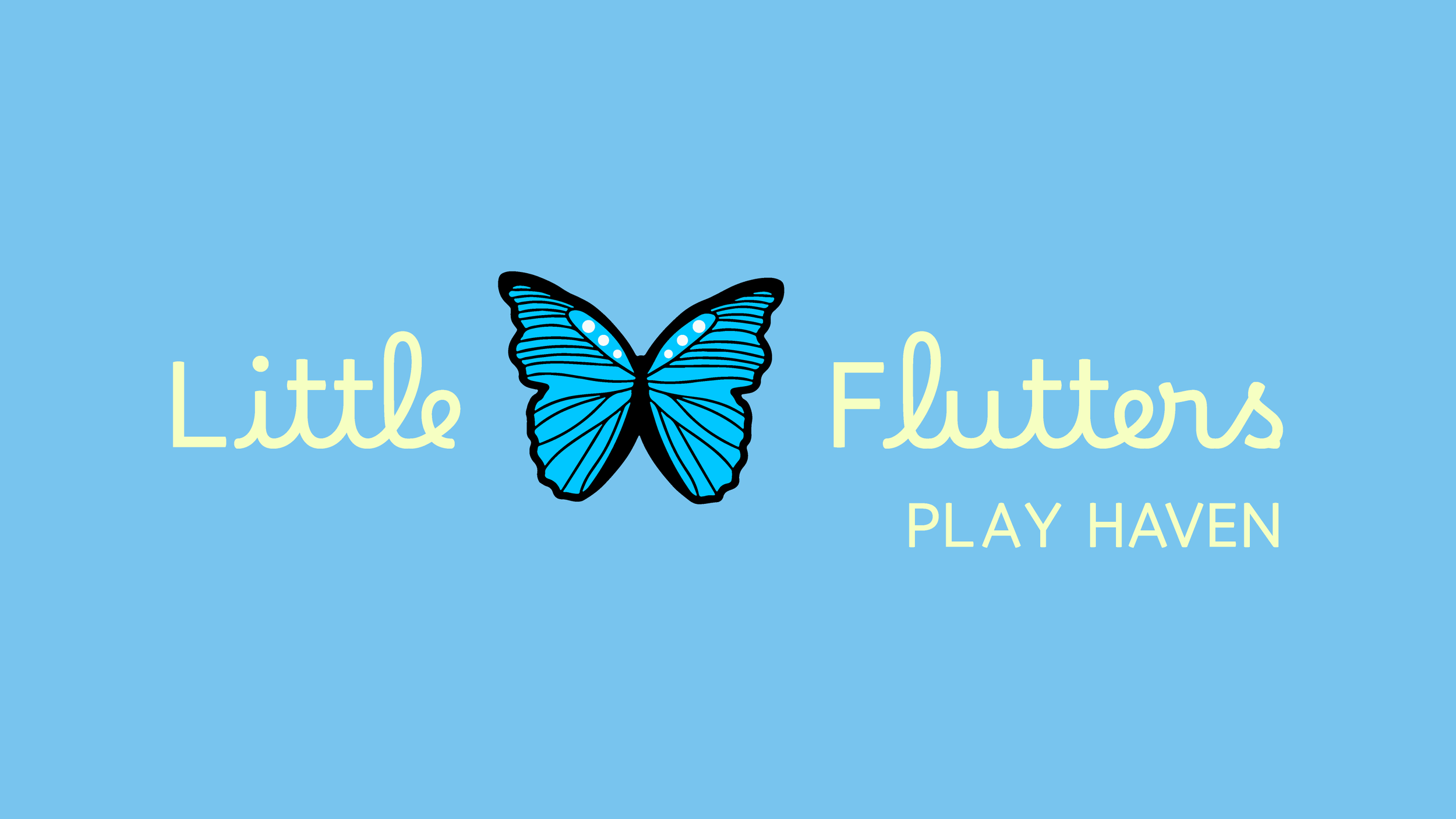
The main logo features a friendly script font paired with a bold blue butterfly, symbolizing transformation, lightness, and play. The butterfly acts as a centerpiece — visually tying the brand together across signage, uniforms, and print materials.
Color Palette:
A cheerful mix of sky blue, pastel yellow, and soft lilac creates a bright and inviting atmosphere that resonates with both children and parents. The colors are chosen to feel uplifting, safe, and full of possibility.
Monogram & Layout Variations:
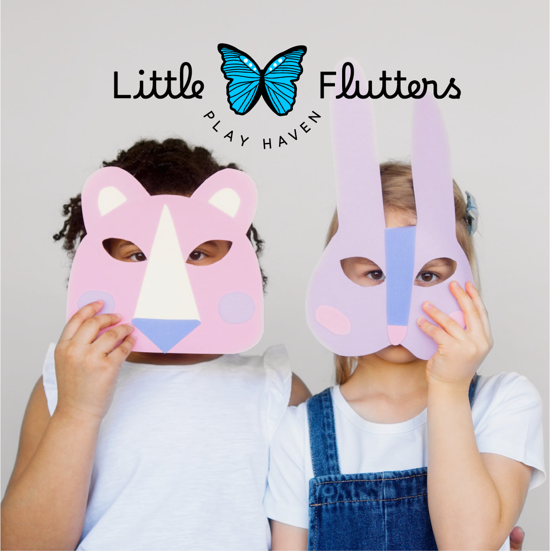
An alternate circular lockup wraps “Play Haven” around the butterfly icon for added flexibility, used across social media, merchandise, and promotional materials.
Typography:
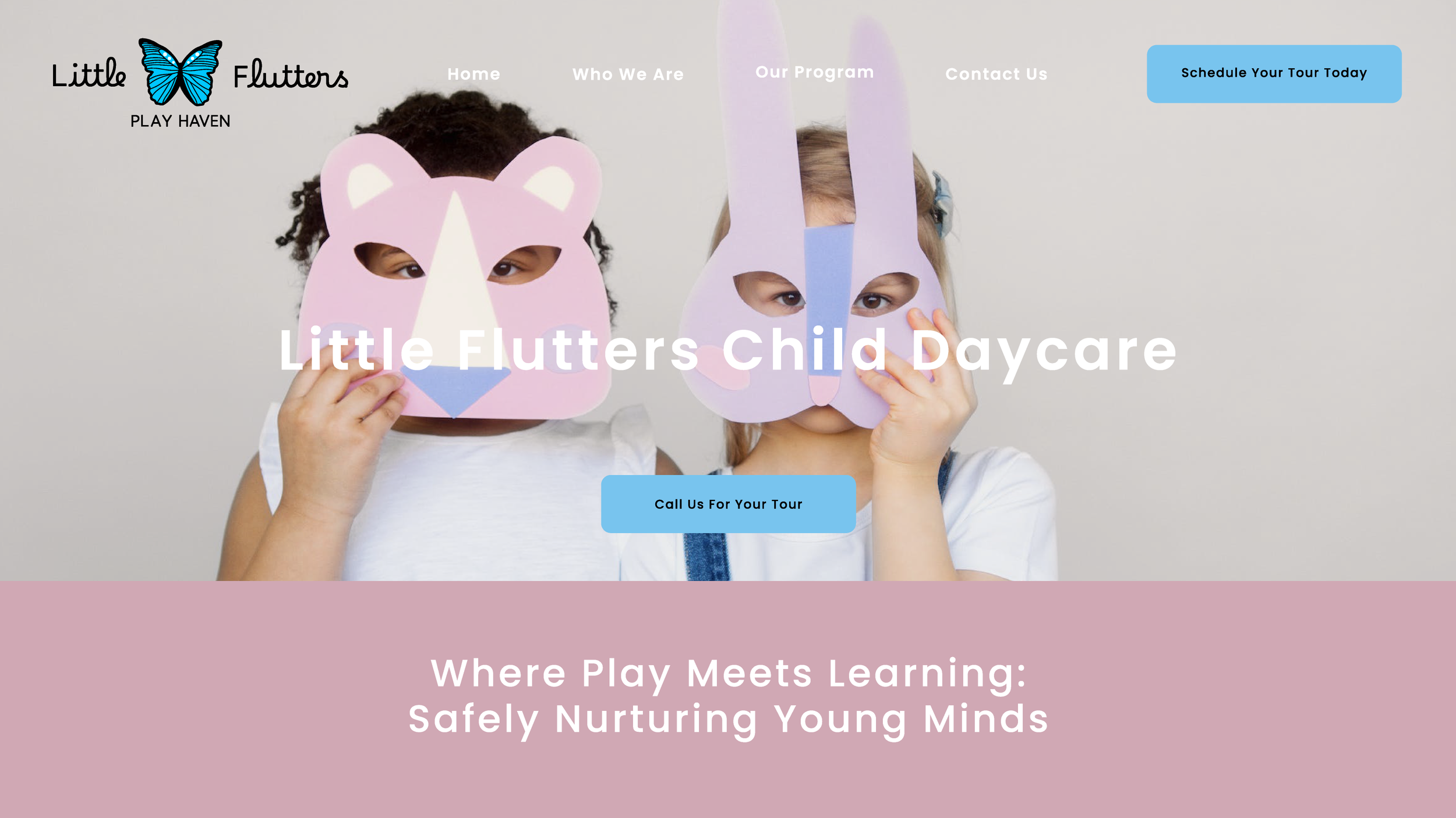
A combination of rounded script and clean sans-serif fonts strikes a balance between youthful charm and clarity — perfect for a space that’s fun yet thoughtfully designed.
Mood & Imagery:
Photography captures candid, playful moments between children — imaginative play, laughter, and connection — reflecting the heart of what Little Flutters stands for.
Tone & Concept
This identity brings to life a world of gentle play and colorful discovery. Every design choice — from the fluttering icon to the pastel palette — was crafted to create a nurturing, magical environment where little ones can feel safe to explore, learn, and let their imaginations take flight.